After several months' work, here we are!
Born in 2019 from a desire to do things differently, our expert digital Product agency combines expertise and benevolence. 5 Degrés was conceived as a Product and co-constructed with all its members.
Over time, we have evolved, refining our vision, consolidating our expertise and broadening our scope of action. Today, we employ over 130 people across three agencies in Paris, Toulouse and Bordeaux, and can address projects across the entire digital product creation chain.
At the heart of this evolution lies an important step for us: the transformation of our visual identity. A carefully thought-out change, designed to reflect our mission, our values and our current positioning in the Digital Product market.
Our new identity was entirely conceived and developed by our teams of designers.
A logo combining values and 5D expertise
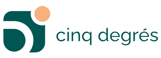
The new 5 Degrés logo visually represents four key elements: proximity, listening and advice, human capital and the Digital Product. These fundamental aspects are embodied in a design that evokes connectivity / links, collaboration and business expertise.
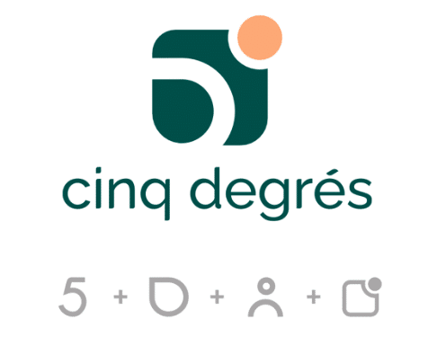
Proximity: Represented by the 6-degree theory, which evokes the possibility that every person on Earth can be linked to another by a chain of knowledge. With the development of networks, this theory has been reduced to 5 degrees.
Listening and advice: Interaction within our communities and with our customers is one of the strengths of the logo. Symbolized by a bubble, listening and advice create an atmosphere conducive to the exchange and collaboration needed to develop a product or service.
Human capital: This is one of the fundamental pillars of 5 Degrés' development. The logo emphasizes its importance and places people at the heart of the brand's operations.
The digital product: 5 Degrés' business expertise is highlighted by a "notification pellet", a flagship element in the digital field. It supports our product-centric approach.
An evocative evocative colors
The colors chosen to represent the 5 Degrés brand are imbued with meaning. Green, a symbol of trust and stability, reflects our commitment to our customers, our employees and our CSR approach. As for the color orange, it evokes support, warmth and creativity, values at the heart of our approach in our relationships with our partners.

An elegant, modern and modern
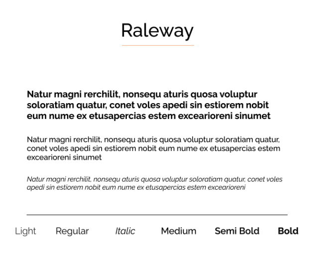
The Raleway font is a sans-serif typeface known for its sleek, elegant design, which fits perfectly with the agency's new identity: more modern, more professional. What's more, its legibility makes it a more accessible font.
Representative representative
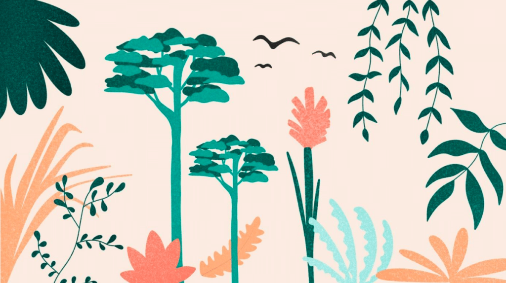
At 5 Degrés, we've always been passionate about stories of exploration and adventure, and this has been reflected in our choice of illustrations since the agency was founded. Joining 5 Degrés is much more than joining a team, it's embarking on a human adventure where every day is a new exploration, every project is a quest into the unknown and every collaboration is a shared adventure. The illustrations perfectly embody this vision, while adding a touch of dynamism (performance) and gentleness (benevolence).
A freshly freshly renovated
As part of our brand evolution, we've completely revamped our website. (We hope you enjoy the experience!)
This redesign aims to offer a more modern and comprehensive experience to our visitors. By focusing on ergonomic and accessible design, we aim to ensure that everyone can easily access our information and services. In addition, we are committed to making our website more environmentally friendly by adopting sustainable development practices, while offering innovative features to meet the needs of our users.
Many thanks to theGalopins web agency for their support on this project.
A new adventure 5D adventure begins
Every element of our new identity has been designed by our own staff, the key players in this wonderful adventure. In a constantly evolving sector, we made the choice to adapt, and we're proud to present the result today.
